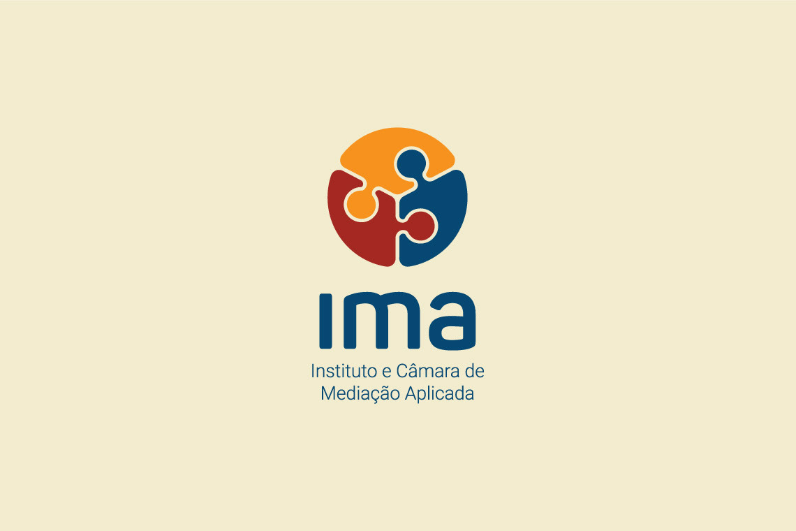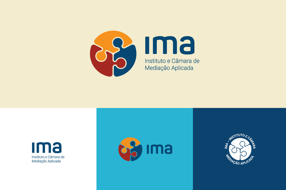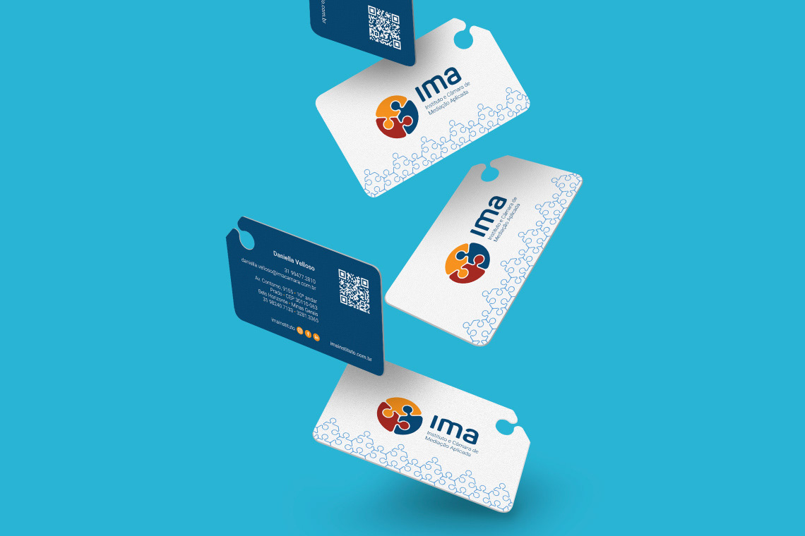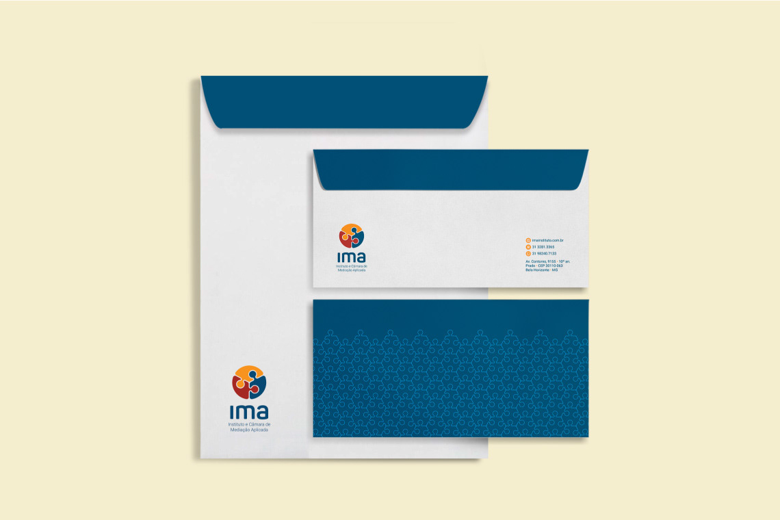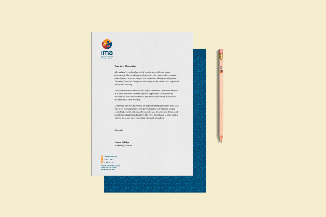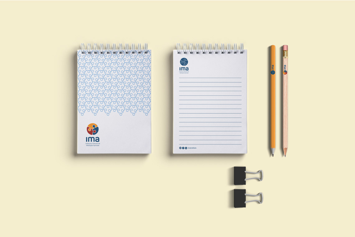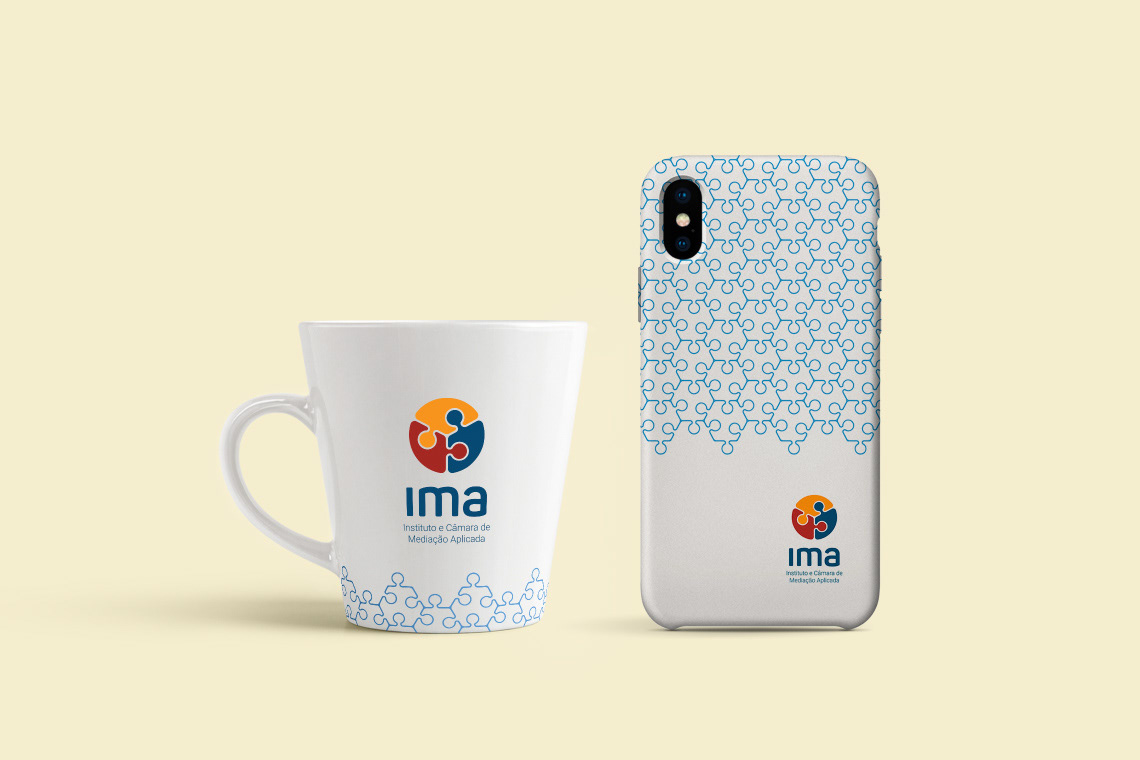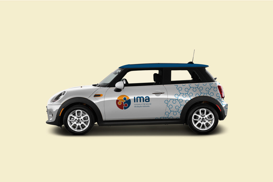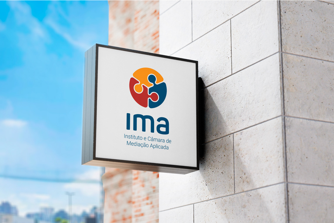
[PT] O Ima – Instituto e Câmara de Mediação Aplicada – se dedica ao ensino da mediação e, também, a resolução de conflitos por meio da mediação, negociação e conciliação. Nesse projeto eu fiz o re-design da marca tornando o ícone mais simétrico e sem pontas retas para reforçar a ideia de fluidez no encontro das peças de quebra-cabeças que compõem a marca, afinal, a mediação não pode deixar arestas. A identidade visual introduziu uma fonte simples, moderna e de fácil leitura. A paleta de cores substituiu os tons escuros por tons claros na logo e identidade visual. Finalizando a identidade eu criei um padrão de quebra-cabeças para que conecta todas as peças que estabelecem ponto de contato com o público.
[EN] The Ima – Institute and Chamber of Applied Mediation – is dedicated to the teaching of mediation and also to the resolution of conflicts through mediation, negotiation and conciliation. In this project I re-designed the brand, making the icon more symmetrical and without straight tips to reinforce the idea of fluidity in the encounter of the puzzle pieces that make up the brand, after all, mediation cannot leave edges. The visual identity introduced a simple, modern and easy-to-read font. The color palette replaced the dark tones with light tones in the logo and visual identity. Finishing the identity I created a pattern of puzzles so that it connects all the pieces that establish a point of contact with the public.